Visualizations
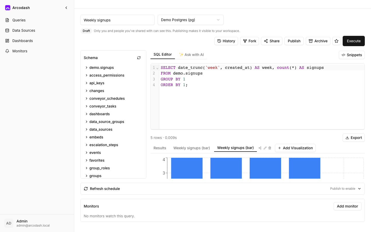
A visualization renders one query’s result. A query can have several visualizations attached to it — the same result shown as both a table and a chart, for instance — and each is added to a dashboard independently.
Table
The default view for any result: a sortable, paginated grid of the raw rows.
- Columns — hide any column you don’t want shown, and override its display name without touching the underlying query.
- Rows per page — how many rows show before paging.
- Click a column header to sort by it; click again to reverse or clear the sort.
Line / Bar / Area / Pie / Scatter charts
One editor covers all five chart types — switching the Chart type dropdown re-renders the same column selections as a different chart, so it’s cheap to try a few before picking one.
- X-axis column — the column plotted along the x-axis (or grouped by, for a pie chart).
- Y-axis columns — one or more columns to plot as series; check as many as you want plotted together. Picking a column already used for the x-axis removes it from the y-axis selection automatically, so you can’t accidentally plot a column against itself.
- Stacking (line/bar/area) — None, Stacked, or 100%, for comparing series as a share of a whole rather than side by side.
- Show legend — a checkbox; on by default.
A pie chart always uses the first selected y-axis column as its slice values, labeled by the x-axis column. A scatter chart plots every selected y-axis column against the x-axis column as its own series.
Counter
A single number, optionally against a target.
- Value — either a specific column and Row number (1-indexed) from the result, or a count of the result’s rows.
- Prefix / Suffix — text wrapped around the number (a currency symbol, a unit).
- Target column (optional) — compares the value against another column’s value and shows an up/down indicator based on whether the value meets or exceeds the target.
[!TIP] Point a counter’s value at row 1 of a query that’s
ORDER BY’d to put the number you want first — the counter itself doesn’t do any aggregation, it just reads a cell out of the result.
Funnel
A step-by-step bar comparison, each step sized relative to the largest one — the classic conversion-funnel shape.
- Label column — the name shown next to each step.
- Value column — the number each step’s bar is sized by.
Each row in the result becomes one funnel step, in the order the query returns them — so the
ORDER BY in your SQL controls the step order shown.
Auto Visualize
If your organization has an AI provider configured (see AI provider configuration), an Auto Visualize button appears once a query has a result. One click asks the provider to pick the best-fitting visualization type — table, chart, counter, or funnel — and its full configuration in one shot. What lands is an ordinary visualization: open its editor and adjust it like one you configured by hand.
Only the result’s column names and types plus its row count are sent to the provider — never the row values themselves. See Data handling & privacy for what every AI feature sends.
Other types you’ll see listed
The visualization type picker also lists Pivot Table, Cohort, Map (Markers), Map (Choropleth), Sankey, Sunburst, Word Cloud, Heatmap, Details, and Box Plot. Picking one of these adds it, but it renders a “coming soon” placeholder instead of an actual chart — they aren’t implemented yet. Stick to Table, the line/bar/area/pie/scatter family, Counter, or Funnel for a visualization that actually renders.
Where to go next
- The SQL editor — producing the result a visualization reads from.
- Core concepts — how a visualization becomes a dashboard widget.